Are you ready for some sickeningly sweet cremes? Sadly, they're not particularly good tasting. Trust me, I tried. They're the other half to Zoya's newest collection pair,
Focus and
Flair. As I mentioned in
my review of the Flair collection, my heart was really more drawn to
Focus, so let's check that out today.
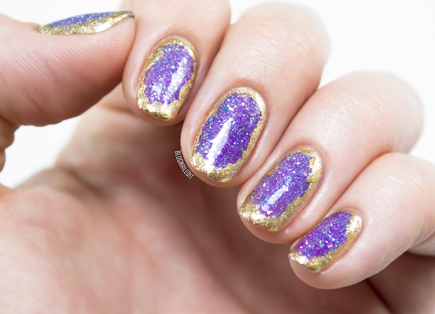
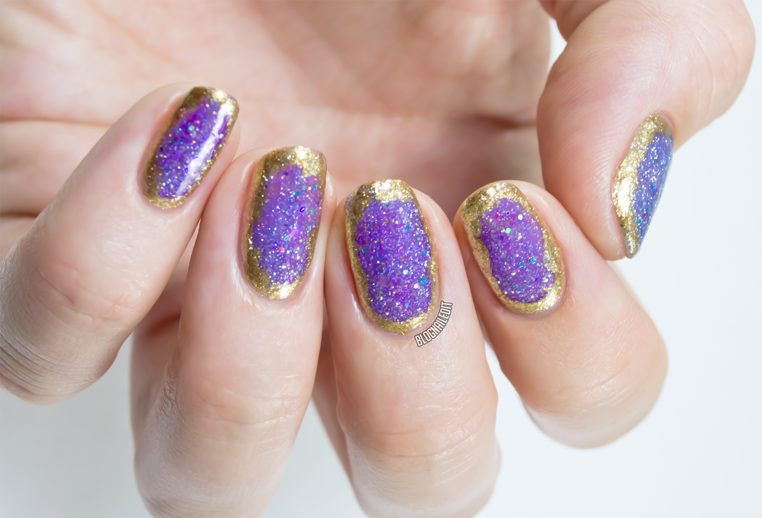
I'd seen a fantastic dark to light gradient on Pinterest in the past (
this one here) and wanted to duplicate that at some point, but I really loved the idea of two colors from this collection,
Hannah and
Lidia, together. So I sponged on a gradient with the two and embellished it with some skull charms from my collection. I believe the charms were from
Born Pretty Store and
Winstonia, but they don't appear to have these particular charms anymore.
I call this nail art "Hocus Focus".
 |
| Click to enlarge! |
See how well the two shades blend with each other, even with my not-so-on-point gradient? I guess I just need to do more gradients! I didn't adhere the skulls with anything other than top coat, because I knew I would be taking this off for more swatching.
Now let's look at
Hannah,
Lidia, and the rest of the girls from
Focus up close!
 |
| Zoya - Charli |
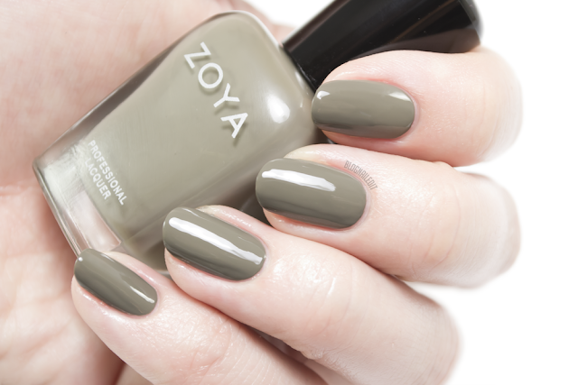
First is
Charli (2 coats). I think
Charli is much prettier to me than the
Flair counterparts
Aggie and
Tris. It's a unique army green putty creme with excellent coverage. In fact, all of the
Focus collection has fantastic coverage, but I was surprised by this one in particular.
 |
| Zoya - Hannah |
Hannah (2 coats) was a surprise as well! Sometimes, when reds are
so bright, they lose opacity and appear sheer, even after two even coats. But
Hannah applied beautifully, and is now a favorite maraschino cherry red of mine.
 |
| Zoya - Sia |
Ok...this color is regal as hell!
Sia (2 coats) makes me want to swing from the chandeliers it's so stunning! (See what I did there?) It's the most royal blue I've ever swatched. It literally looks like the picture of the swatch in person. Damn!